How small efforts can make great differences when brands design elegantly
I can not help it. Everywhere I look I see. I am actively viewing the world constantly observing and evaluating the spaces and objects as they express their relationships for the message. This happens with objects for daily use such as stove tops, television remotes and packaging—just a few of the items that populate our living and active world. I wonder about the process, the audience considerations, the limitations, the goal. I see how some things successfully work, and I see the basic need not effectively supported. Of course, everyone has their own interpretations. I enjoy design most when a brand moves beyond the boundaries and makes the trivial things work in their own voice. I enjoy the brand design when all elements within that message have a harmonious relationship where the team had equal consideration, thought and concern for each element for a goal of a unified elegance of its presence in presentation and function. The following provides examples when such actions occur and the result. The first example, a bamboo toothbrush package.
A Toothbrush Considers the Barcode
Before I opened the package for my bamboo toothbrush, I learned of the company’s mission of sustainability, the goal for the customer and how they would do both. Message-wise, the product encouraged me that I made the right choice. On further observation, the product impressed me with its whole design consideration. The package emphasized their sustainability and green efforts but also worked the mundane elements into the message. The brand treated the barcode with effort to contain it within the brand design.
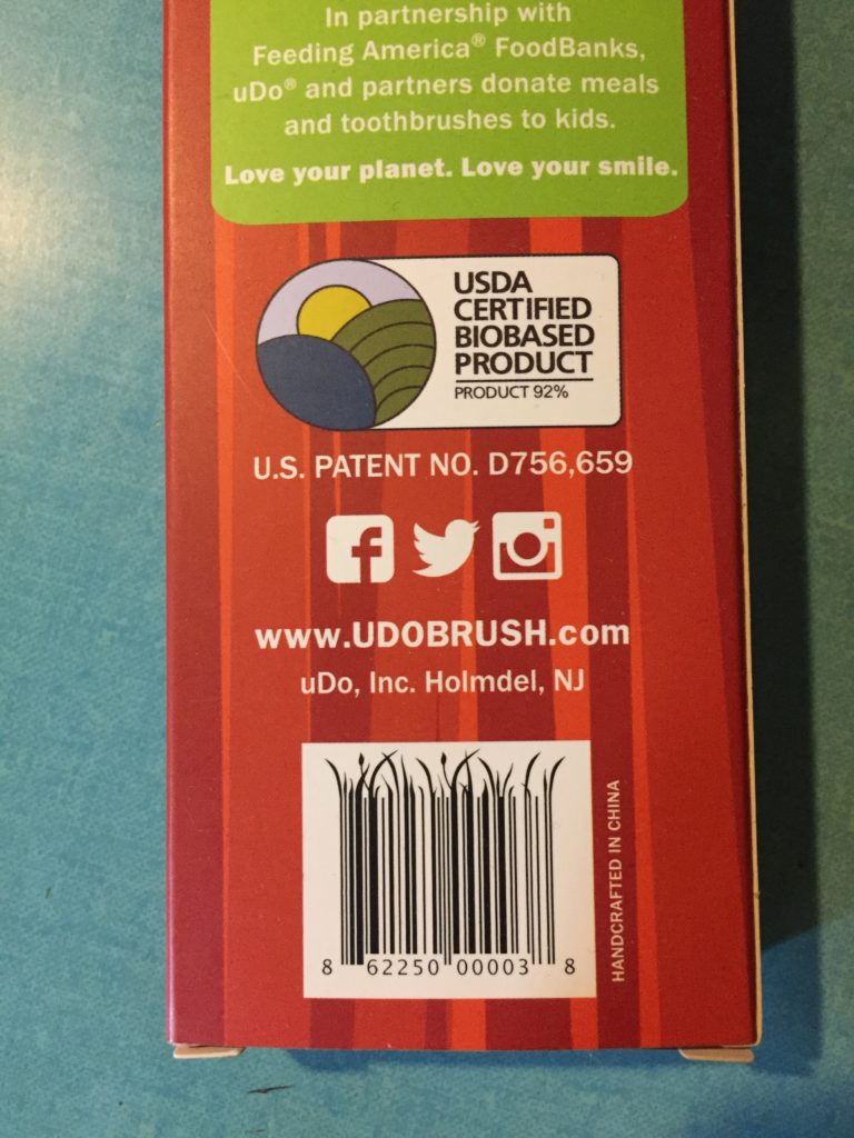
The barcode is a series of varied weight vertical lines in a sequence designed to display a code identifying the product (elements of design still in play here). Usually this pattern sits in a designated white space for high contrast apart from the brand conscious packaging. The barcode is like that loud kid kicking up sand on the beach destroying your peaceful and relaxing day; or that small sticker applied to fruit. Yet this brand extends those lines with a frill that makes it appealing and decorative adding to their brand consideration.
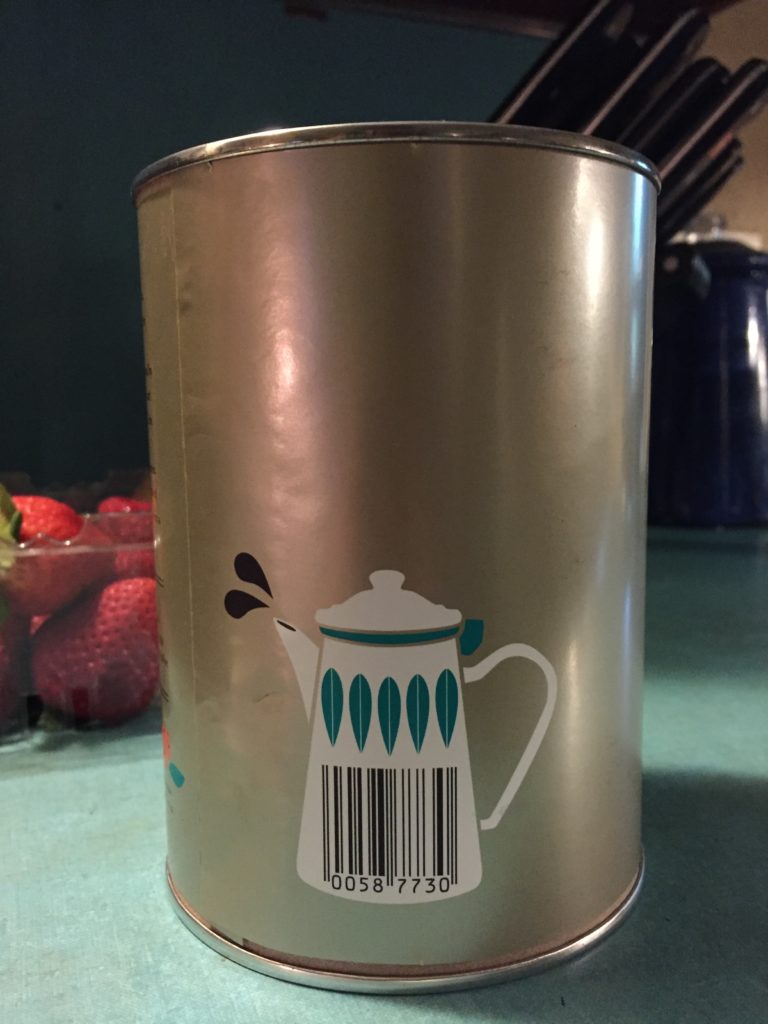
Another product does not play with the barcodes elements but designs the space they sit to feel like they were meant to be part of the package. This coffee bean container has a percolator or pot design reserved so the barcode white space does not feel like a forced rectangle on the otherwise colorful composition to satisfy a packaging requirement. It is subtle, but nicely considered. When design moves beyond just basic effort of doing just enough the design conveys care and respect for the viewer and customer.
Cramming Your Marketing Message and Instructions
A smart play for all elements makes the customer feel appreciated when they purchased this elevated all-things-considered-nothing-left-behind care into the product. Once you see and feel that, you want this same catering from every brand. Certainly the average consumer purchases what they want because of the need or joy they receive from the product. The overall packaging or product design does not have a major influence on their purchase. Graphic design does not determine the whole product value; yet I enjoy when the marketing team considers the entire brand with the product experience.
All perspectives and approaches to their brand and product take into account many marketing aspects:
- the package appearance creating appeal;
- the opening of the package for ease enhanced by creativity;
- the package design crating the product;
- the messages informing the product’s purpose and intended use;
- the instructions clarity and layout as well as customer support for assistance or returns.
Sometimes the company drops this effort sacrificing the impression and potentially compromising the product’s elegance.
There are products that are cheap. There are products that are expensive. The price does not determine full design effort, but no matter the cost, design should be fully considered and produced when making the product.
Reading further you will see an example of how design could have been pushed a bit further to support this ideal of elegance. I am not redesigning to demonstrate my chops; I am presenting small considerations for a brand to permeate their process into their final product.
An Example of Considerate Design in Practice
At my in-laws, a can of Hood® Whipped Cream sat on the table to accessorize the pie and/or ice cream. My younger self recalled the entertainment this canned and its contents gave me. I recalled the sound as the fluffy cream falls onto your pie, ice cream, brownie or open mouth; and the amazement that so much of that product existed in the can. My adult self has a stronger aesthetic eye. I could not wait to enjoy the sweet taste experience but I saw how Hood soured on their product. They could have supported their brand on the can and carefully presented their care for their product so you can enjoy it at its best experience.
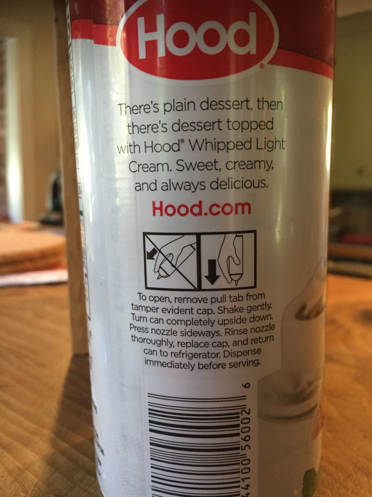
The container’s back side has a brand message and instructions for use. The design appears to have lost some of its potential:
- the message rhythm could be enhanced by creating visual beats;
- the product name wraps to the next line;
- the use and store instructions could be listed for easier scanning;
- the instructions and image relationships could be stronger;
- the images should relate the use more clearly.
The product message.
“There’s plain dessert, then there’s dessert topped with Hood Whipped Light Cream. Sweet, creamy, and always delicious. Hood(.com).” Imagine what this message would sound like if how it was displayed determined the voiceover beat in the commercial:
There’s plain dessert, then (pause)
there’s dessert topped (pause)
with Hood Whipped Light (pause)
Cream. Sweet, creamy, (pause — at least here it works!)
and always delicious.
You almost want to see it like this:
There’s plain dessert,
then there’s dessert topped with Hood Whipped Light Cream.
Sweet,
creamy,
and always delicious.
Hood.
The original design does not allow for this beat. Of course, the can can not always provide the room. Production boundaries dictate for text safe zones for all packaging, but the designer could have played just a bit more to support some of the beat while simultaneously compromising for the marketing team. The marketing team always insists for larger logos, larger type sizes, larger images; but they have to settle on not just screaming everything all at once. Design should lead and direct with a focus of their awareness for a need, how they can provide a solution and who they are but fitting in the space they have. Essentially, design should set the focus and flow. One thing a designer can do: reduce the logo size especially if that logo already exists just a quarter turn on the “front” of the can.
The product
name.
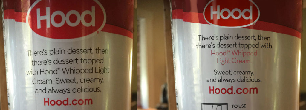
The product name flows in a sentence but wraps to the next line basically breaking the name. If the name was written on its own with the same flow and format, the last word would be identified as an orphan. There are rules and guidelines about your brand enforcement and grammar styles when writing a paper, but nothing generally approved for product names presented in tagline copy. Such instructions would be found in the brand strategy and style guides. These instructions provide a uniform strength and operation to maintain the consistency and respect for the company’s branding and its services or products. In a consideration for a name, not one part should fall from the other when presented within a sentence especially as short as a product tagline printed on the product itself. The name should be held to itself.
To support the brand while considering many other factors –such as legibility, physical space, medium technology– the name length and its familiarity should be presented with care to support and respect the product. The name could have been “Hood (line break) Whipped Light Cream,” but the visual balance would be too bottom heavy with the large negative spaces around “Hood” sitting on its own line. To work with visual balance, the name breaks in the middle space for two words at the top followed by two words wrapped to the next line.
Along with the placement considerations, why not support the brand with additional visual emphasis? Highlighting the product name with the brand and product color adds a bit on the focus and supports the beat within the sentence.
The instructions, generally.
I have indicated three concerns with the product instructions: 1) readability; 2) image text relationship; and 3) image message.

The instructions contain illustrations and guideline language sentences as two separate entities in one big unfinished object. Combining a few design strategies, the composition could work together as one whole with distinct relationships and clarity to support the product and inform the consumer—like this consideration.

The text indicates a series of actions to use the product. Along with the use, the instructions also indicates how the product should be stored for future use. Thus, the text could be set into two groups of operation: how to use to serve; and how to store for later use. Each phrase has been written in an instructional grammar format–a format that suggests a list of steps. Instead of streaming each phrase into one paragraph, the instructions would work more clearly in a list. Still addressing clutter, reducing visual noise and working within space limitations; we could avoid bullets and set paragraph spaces and align the text with the respective image. The negative or white spaces allow for clear identification of separate actions.
The list is also reordered. “Dispense immediately before serving” should be listed with how to use the product and not following how to store the product. Now these two lists have a title to clearly indicate what actions would help with what purpose: to use; or to store.
The illustrations were revised to be consistent in render and support the text. Ideally, an illustration for each instruction would be the strongest support for those who prefer image over text; however, space is limited. Single-time actions –“Pulling the tab” to open the canister– were not rendered. The dispensing image has been revised to place the finger onto the nozzle; pushing on the dome will not dispense the whipped cream. The image should correctly show how to use the product.
Though these were small modifications, the careful attention to detail enhances the product two-fold: reflect the brand; easily conveys to the customer the product information.
Design operates to attract you based on your manner, your style, your personality and your influences. Design entices you to buy based on a real or implied need. Design creates a want. Design establishes a relationship with the buyer by separating itself from other brands. Enjoy the act of seeing and respect what the visual world offers but that world should respect you the viewer and participant with authentic effort. They should be presented with their best presentation forward.
