What is a Monotype?
For a long time, I called my print work monoprints. They were monoprints simply because I believed the result of my process which used printmaking tools and medium —printing inks; a printing press; brayers— with the printmaking technique —transferring a produced image from one surface to another— created a single (mono) print: ergo a monoprint. The prints I made were not an edition of a highly-skilled, indistinguishably set of images; I print a single image that may not be exactly duplicated. The accumulation and logical assumption of all of this thinking meant that my produced, single-printed image on paper was a monoprint. Eventually, I came to a more academic understanding of my work.
Once you start the journey into teaching, you begin to understand that you should relearn what you know. You relearn to teach what you know. The relearning process is necessary so no practiced or personally intuitive motion is missed in the presentation and teaching of that skill. When you have practiced a skill, there may be motions that become habits. Habits are mistakenly missed. Re-learning about printmaking and my printing process revealed to me of my misunderstanding.
True Monoprints are prints that come from the same source and/or fixed surface (called a matrix) and later modified with additional processes; for example, each black-and-white print of an edition from the intaglio process were later modified with a different medium such as watercolors. The watercolor application would alter each print significantly enough to identify them as different from one another making each of them a single print. A printed edition must have no variation in its execution.
Monotypes are closely related to monoprints. The process involves a transfer of an image from a surface onto another, however the templates are different. Monoprints, as mentioned earlier, work from a matrix. A matrix is a fixed surface produced through means of adjusting a surface to hold ink. Monotypes start from a clean un-etched surface or non-matrix. The surface can be of any material. Traditionally, the monotype surface has been tempered glass, but any desired surface capable of releasing the ink onto another surface could be utilized. The ink applied onto the flat surface can be altered by brush, brayer, rag, cloth and any other tool to create the composition. The composition will then be transferred to a printable surface by pressure. Pressure onto the paper can be applied by a printing press, a roller, a spoon or any other object. This pressure sets the impression from the surface onto the paper. The same process could be followed again but the image can not be precisely duplicated where no minute detail may have any rendered variation.
The Process
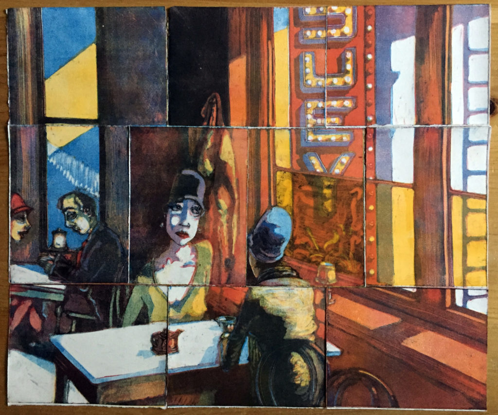
I provide an example demonstrated with the production of Edward Hopper’s Chop Suey in my style. A similar approach was also explored with several other works: John Sargent’s Lady Agnew; James McNeill Whistler’s Portrait of the Artist’s Mother; Andrew Wyeth’s Christina’s World and Winter 1946; and Grant Wood’s American Gothic.
Basically, I work using the subtraction process by removing ink from several plates registered for a single image. I combine the plates in a layered sequence onto the paper. Sometimes all of the plates are prepared before I print; other times I print a plate one at a time. To decide where the ink will remain on the transfer surface, I use sketches, drawings or original photographs as templates. I learned of this technique from a peer in a printmaking course—his work had a painterly quality that remarked Toulouse-Lautrec sketches but the graphic presentation of the lithographs.
Because I rely on templates to register several plates into one print, I start with a drawing or an original photograph. The printing process creates a mirrored impression. For the print to resemble my drawing, I manipulate the image to a flipped copy. I achieve this mirrored image through one of several different means: I may use a light box and simply flip the sketch; a flipped photocopy; traced the back of the drawing; or through a digital photo-manipulation application and a computer printout.
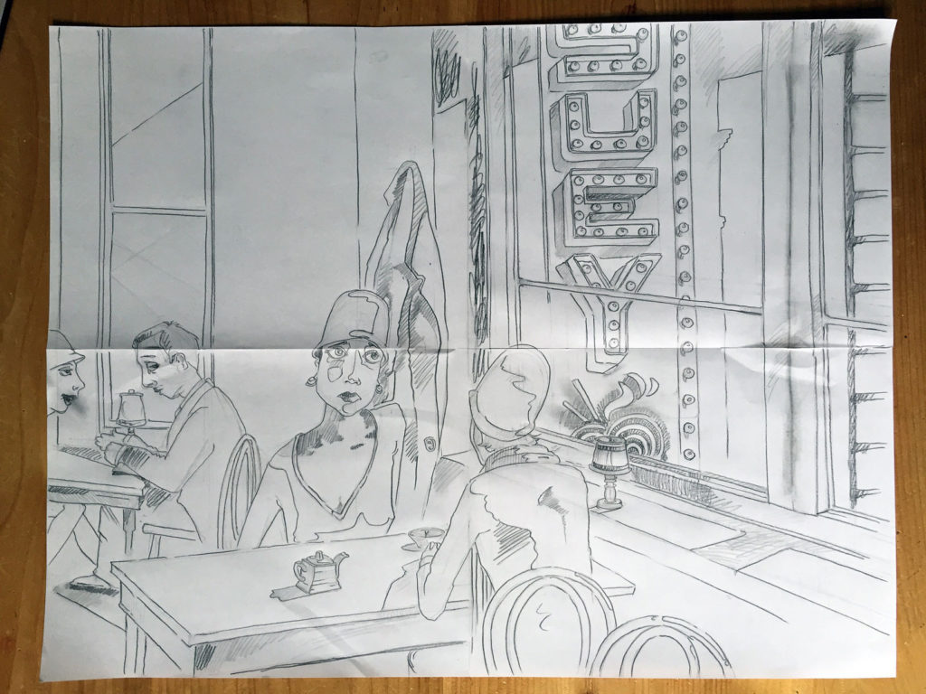
I work with multiple plates where each plate is a separate color. My color palette remarks the offset print: yellow; magenta or red; phthalo blue or ultramarine blue; and a black or raw umber. The separate colors combine to eventually blend when printed onto the paper—the process mimics the color separation for mass printing.
The separation process starts in my mind. I design the overlapping colors predicting or anticipating their final blend. Sometimes, the printing order starts with the yellow plate or the magenta plate depending on the desired warm glow for reds and oranges. With this piece, I started with magenta plate since the ink was modified to be a transparent base. If I did not modify this brand’s magenta, it sits very heavy on the paper obliterating any yellow and creating dark purples very close in value to black.
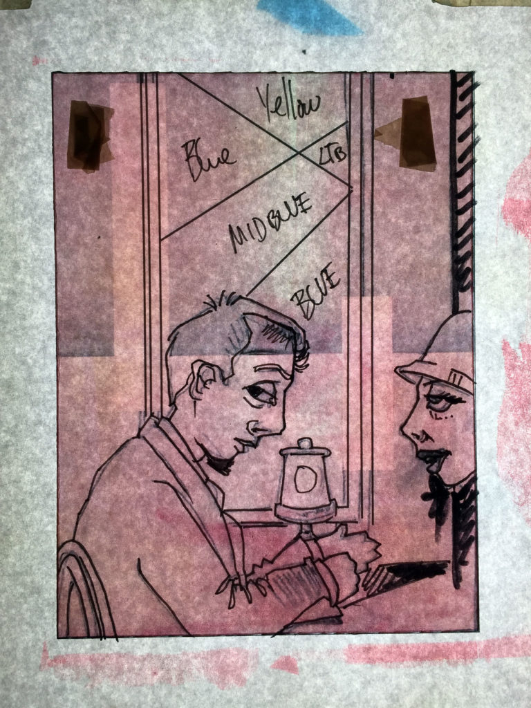
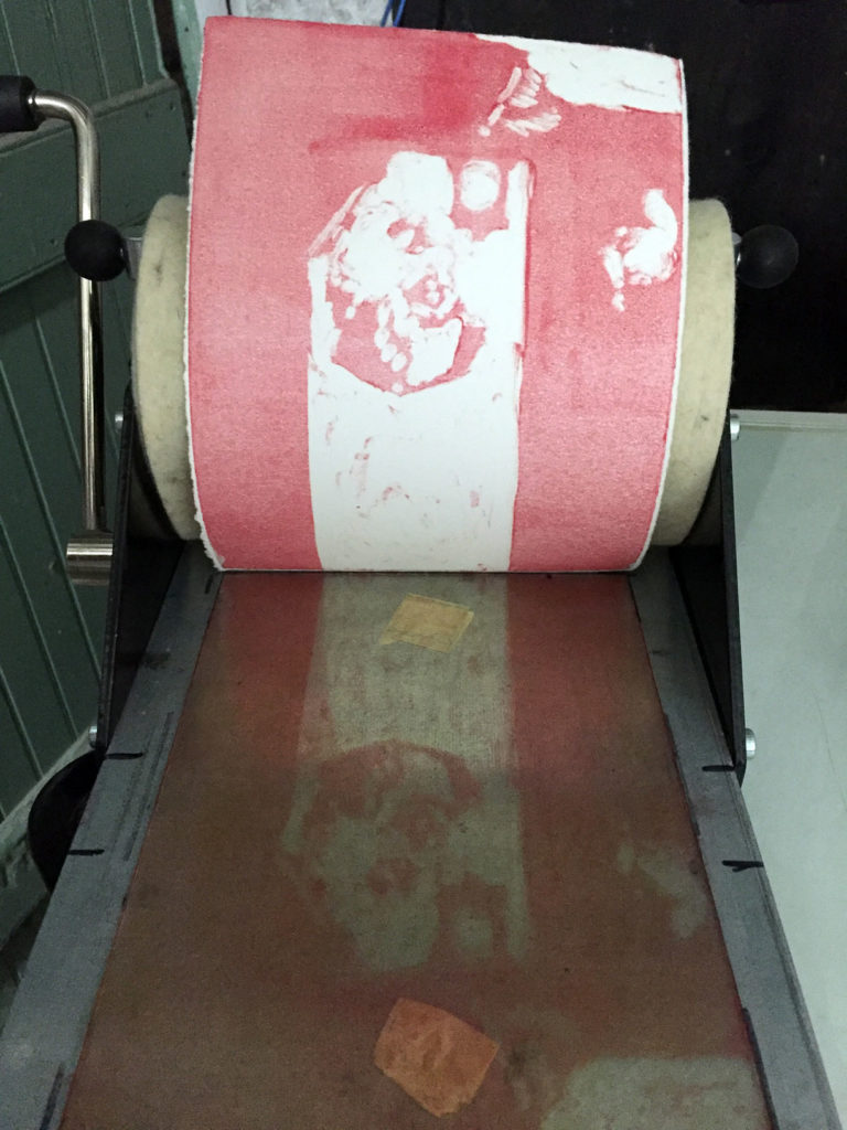
With the magenta printed, I can assess if the result matches my expectations and how to react with the next color plate—in this process, yellow. I set a different plexiglass plate on my template prepared with yellow ink. The ink has been removed so yellow appears in spots in the composition or blends with the applied magenta along with the future blue and black plates for intense blues, purples, browns and/or greens.
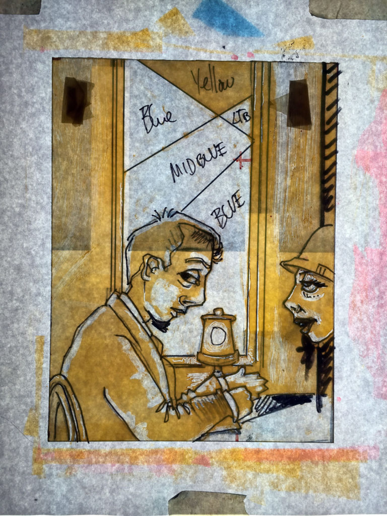
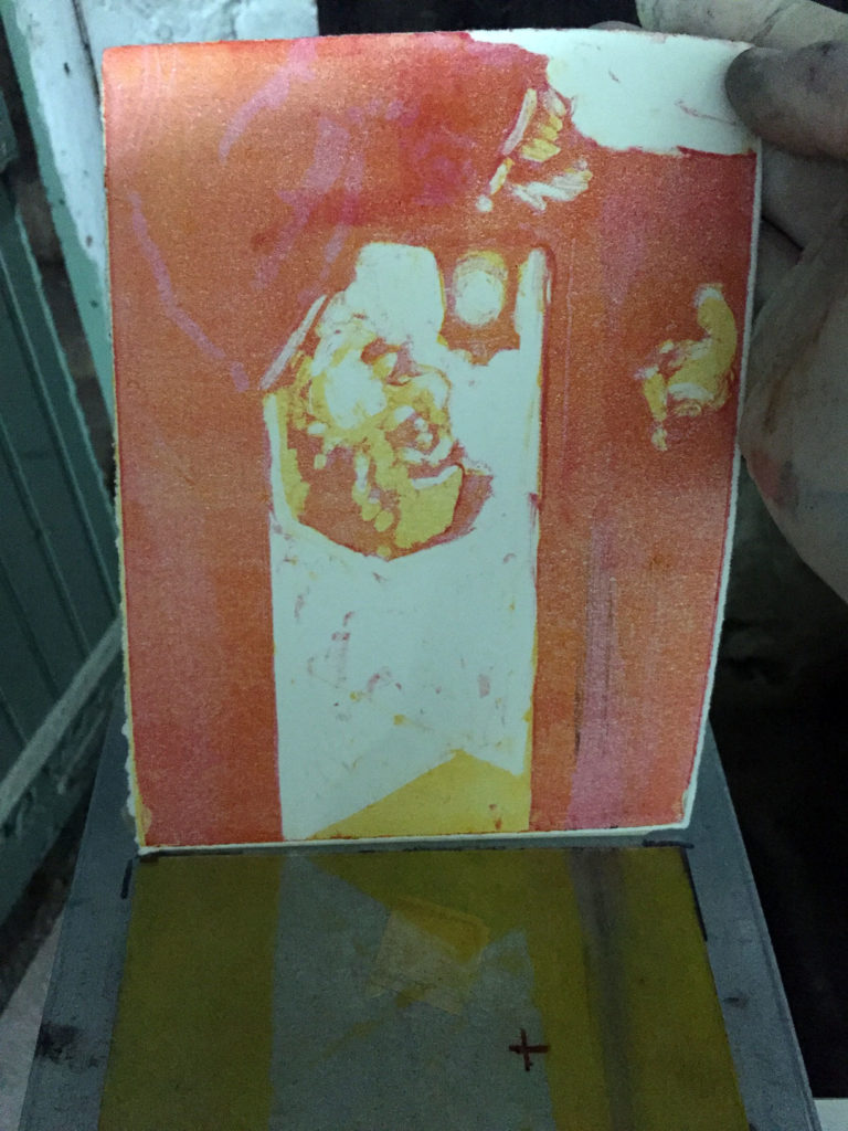
The yellow’s strength applied after the thinned magenta usually creates a pale red or an orange. The magenta on its own appears to be pink. If I desire a stronger orange, I set an additional yellow plate for that orange or I may chance another magenta application. In this case I felt satisfied with the process and moved onto the blue.
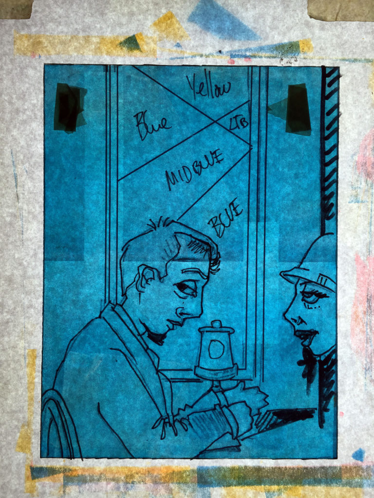
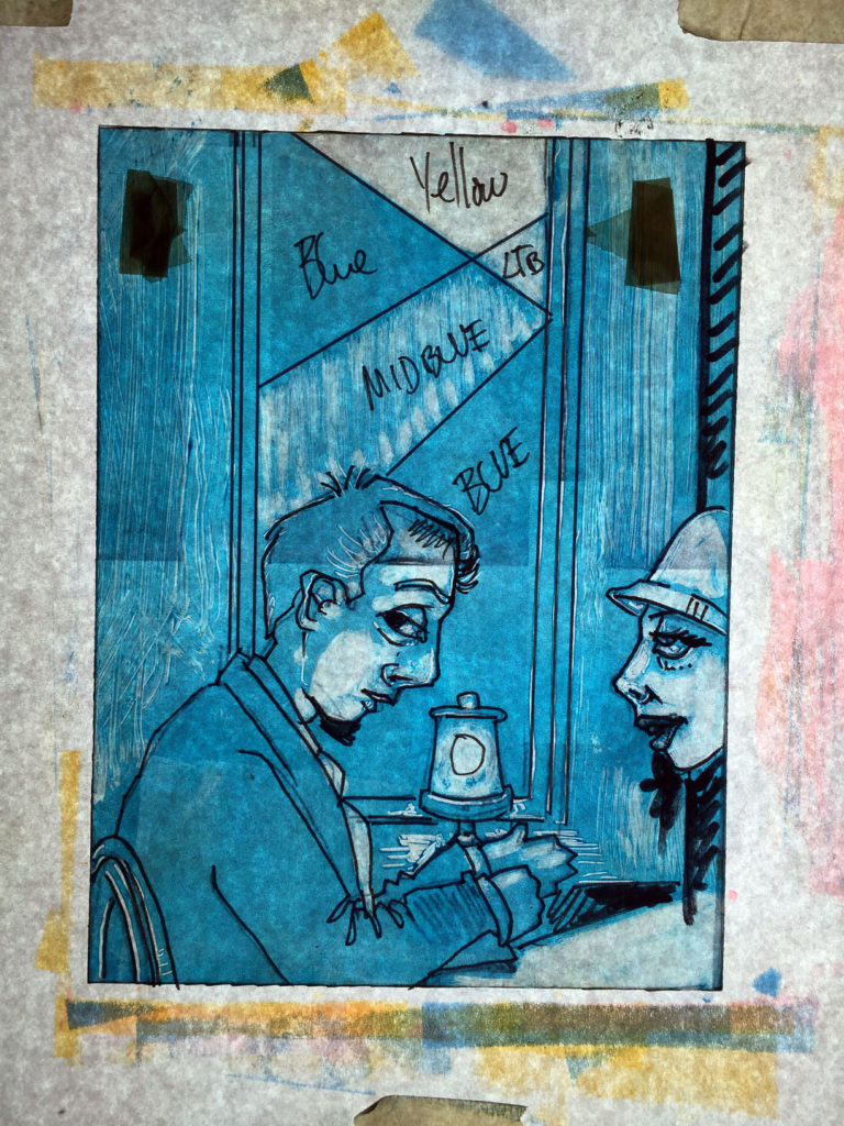
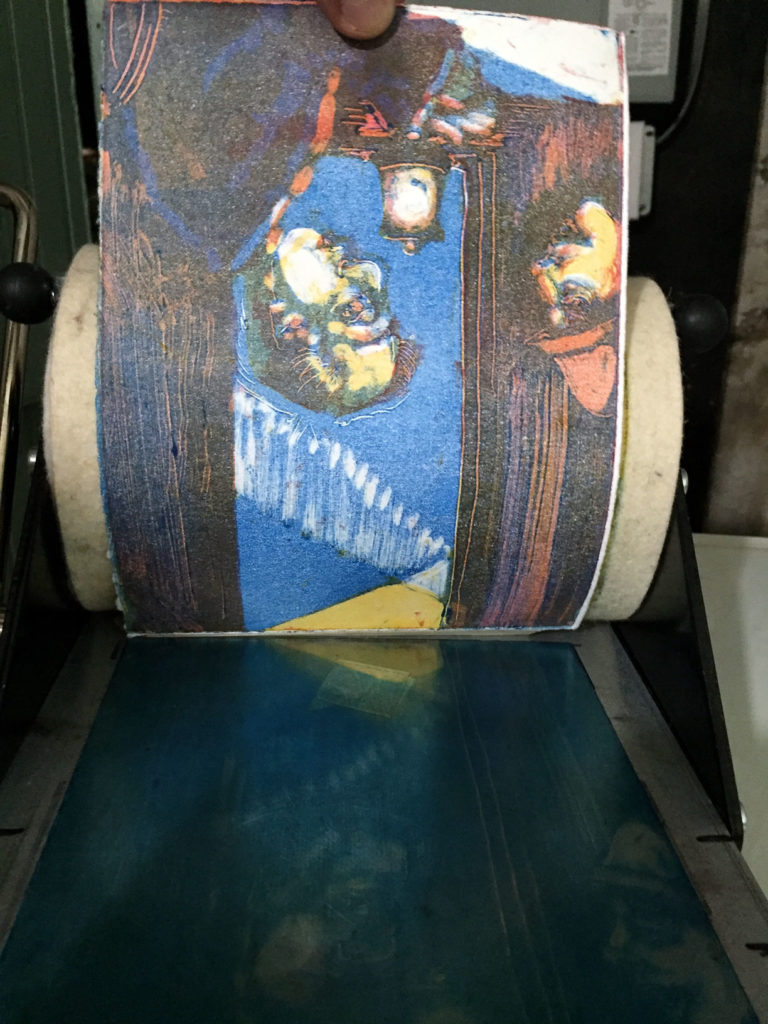
The blue mixed with the magenta and yellow impressions created this printed step. The color registration was bit too loose. Some of my color applications did not fit exactly to the previous impressions and these slips may blur details exampled by the eye and hand renders. At this point I may try to calculate whether another blue plate may fix these details or if I should move onto the final dark plate to finish the print. In this case, I noticed that the red still needed more intensity. The woman’ hat and lips were too dull, and the tie needed to balance any effort—they needed to pop and anchor as a focus to attract eyes.
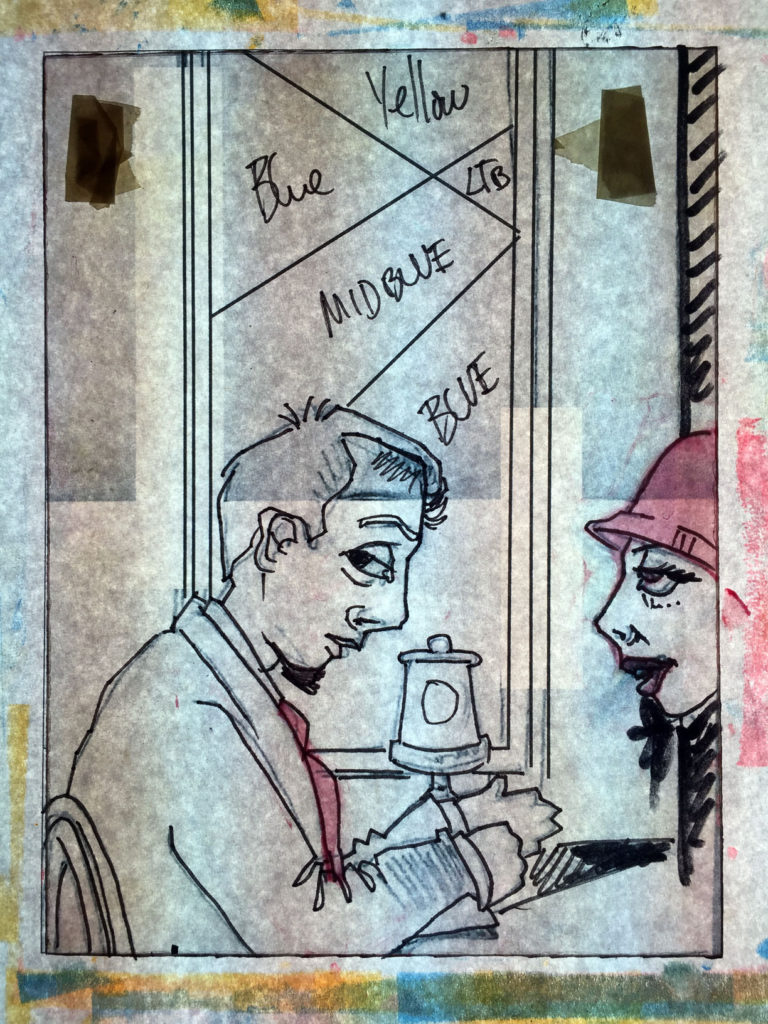
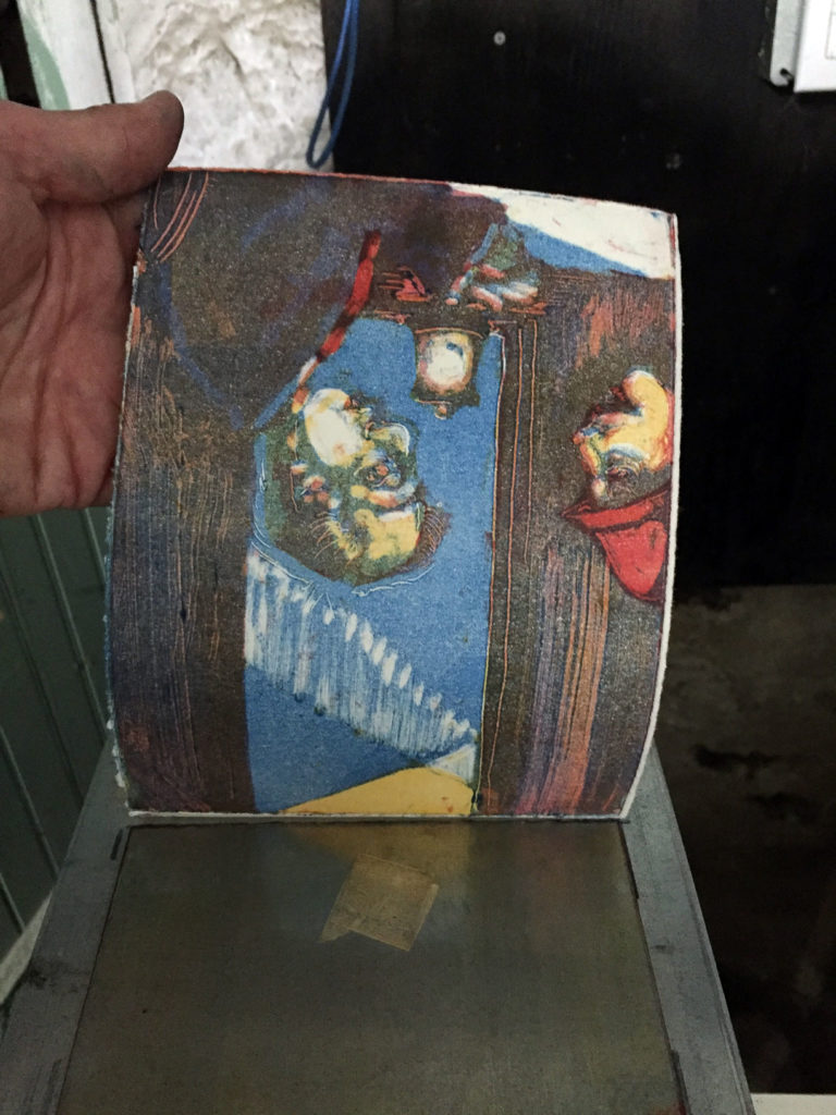
Now, I set the black plate. With commercial offset printing, the black plate creates the contrast for shadows and the final contours to contain color fields and define details. Theoretically the primary colors should combine to make black, but their combination only results in a pale black that resembles a brown. I rely on the black plate to finish my print into a tighter render resembling my source image.
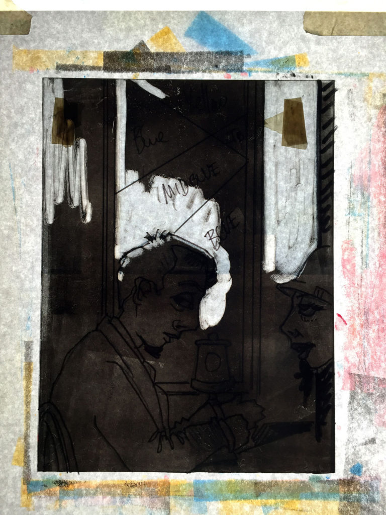
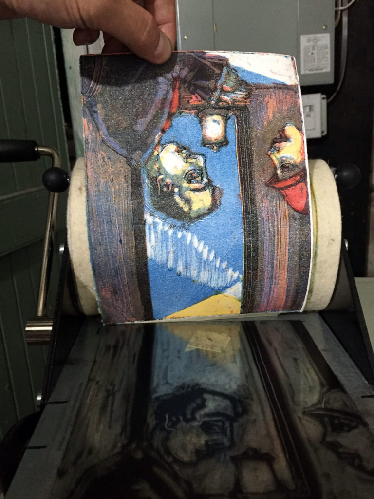
The black plate did help create the light sources as well as define the details and the contrast for compositional flow and balance.
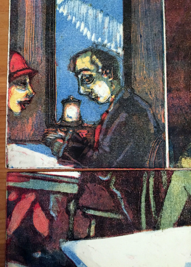
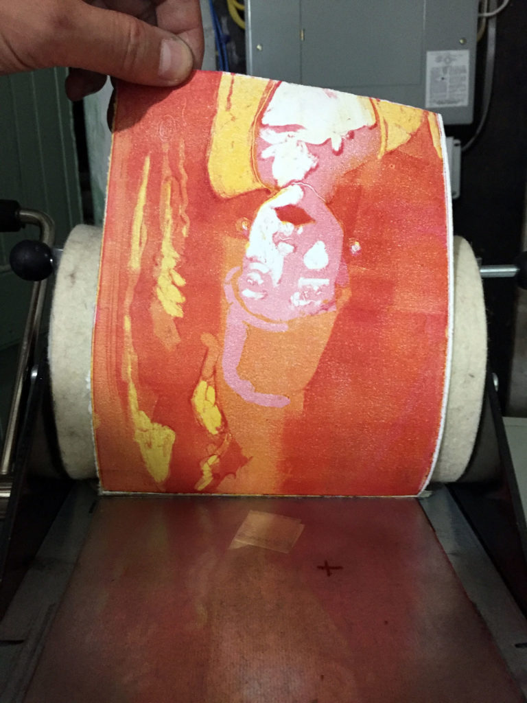

Five plates of color: magenta, yellow, magenta, blue, and black.
For this piece, I printed 10 monotypes to tile together. This work is an interpretation remarking on of several American artists that I mimic in my style. My goal is to create a series of tiled prints of several American artists into mocked quilts.

To see more of my monotypes, view my portfolio.
Reference:
Monoprints.com
15th Street Gallery
Artsy – 9 types of Printmaking
